PT:
N Sol
É uma empresa que oferece energia solar sustentável e confiável para residências, negócios e agronegócios, além de entregar soluções completas para uma transição eficiente e responsável para energia renovável.
A logo foi cuidadosamente projetada para transmitir a identidade e os valores da marca. A tipografia curvada suavemente cria fluidez e modernidade, enquanto o ícone circular remete ao sol, fonte poderosa de energia renovável. As pernas irradiando do círculo representam raios de luz e potencial ilimitado. O símbolo de check simboliza confiança e soluções resolvidas.
EN:
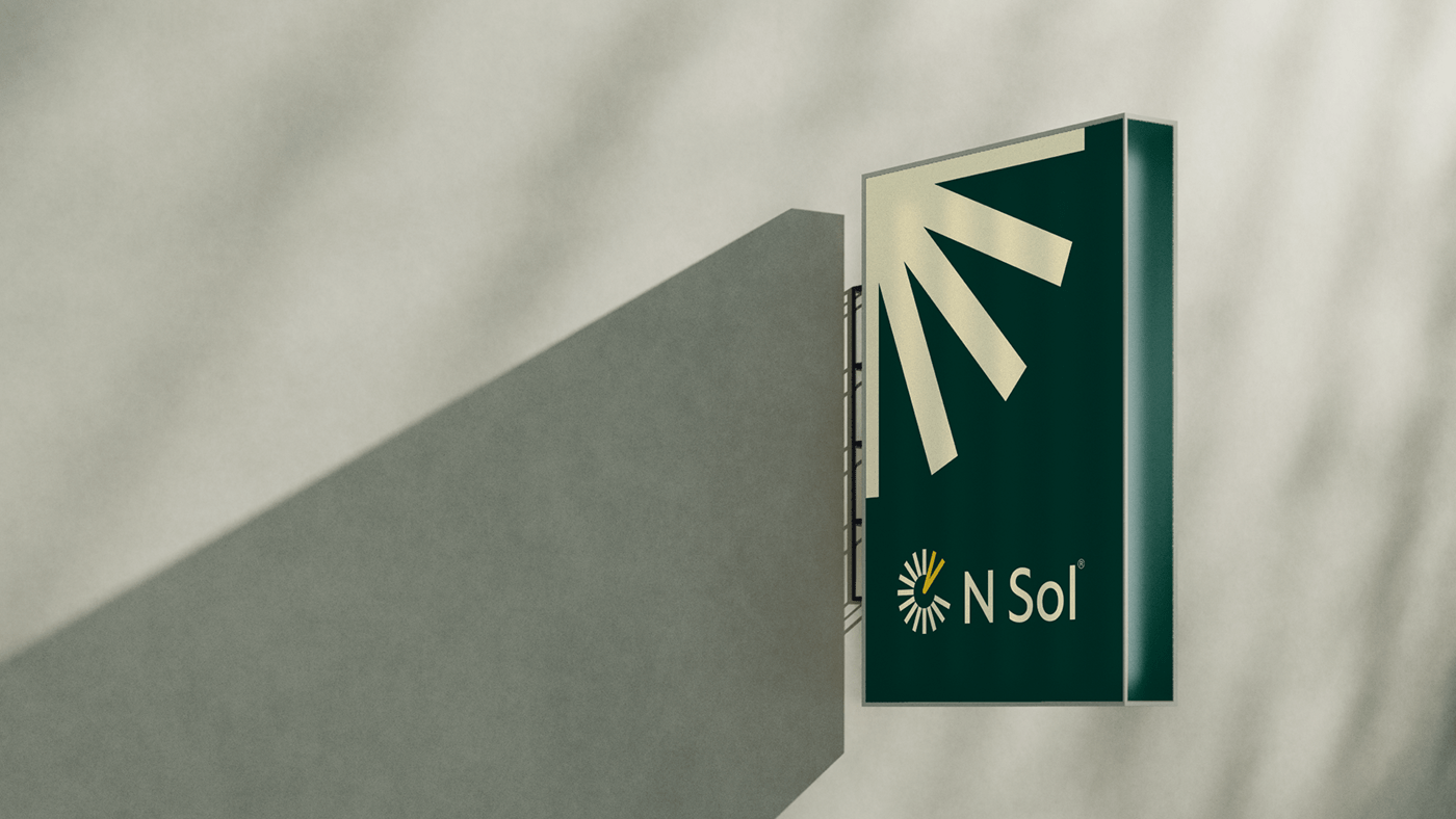
N Sol is a company that offers sustainable and reliable solar energy solutions for homes, businesses, and agricultural ventures, while delivering comprehensive strategies for an efficient and responsible transition to renewable energy.
The logo has been carefully designed to convey the brand's identity and values. The softly curved typography creates fluidity and modernity, while the circular icon alludes to the sun, a powerful source of renewable energy. The rays emanating from the circle represent beams of light and unlimited potential. The checkmark symbolizes trust and resolved solutions.

PT:
A paleta de cores foi muito bem escolhida e apresenta as cores verde escuro, amarelo, laranja e bege claro, evocando natureza, renovação, energia solar, positividade e confiança.
Também criamos uma textura de apoio, inspirada no sol, fortalecendo a identidade da N Sol.
Juntos, trabalhamos para que a empresa transmita para seu público alvo que está comprometida com soluções completas e inovadoras.
EN:
The color palette was carefully chosen and features dark green, yellow, orange, and light beige, evoking nature, renewal, solar energy, positivity, and trust.
We also created a supporting texture inspired by the sun, strengthening N Sol's identity.
Together, we work to ensure that the company conveys to its target audience its commitment to complete and innovative solutions.